
According to research backed by Google itself, visitors take between 17 and 50 milliseconds to form their perception about a website or web page.
One way to make a strong first impression on visitors and encourage them to stay on your website longer is to summarise your web page in a table of contents (TOC). This helps readers quickly scan your content, understand the article’s flow, and jump to the relevant sections, enhancing engagement.
This guide covers everything you need to know about building a website table of contents, including UI design considerations, layouts, examples, and best practices.
TL;DR – Website Table of Contents Examples
Can’t read the whole article right now? Here’s a quick overview of the most common table of contents layout examples:
- Top-of-page layout
- Side-bar layout
- Grid layout
- Floating layout
- Hierarchical layout
- Expandable layout
Keep reading to understand which table of contents layout to use for your content to enhance your website’s user experience.
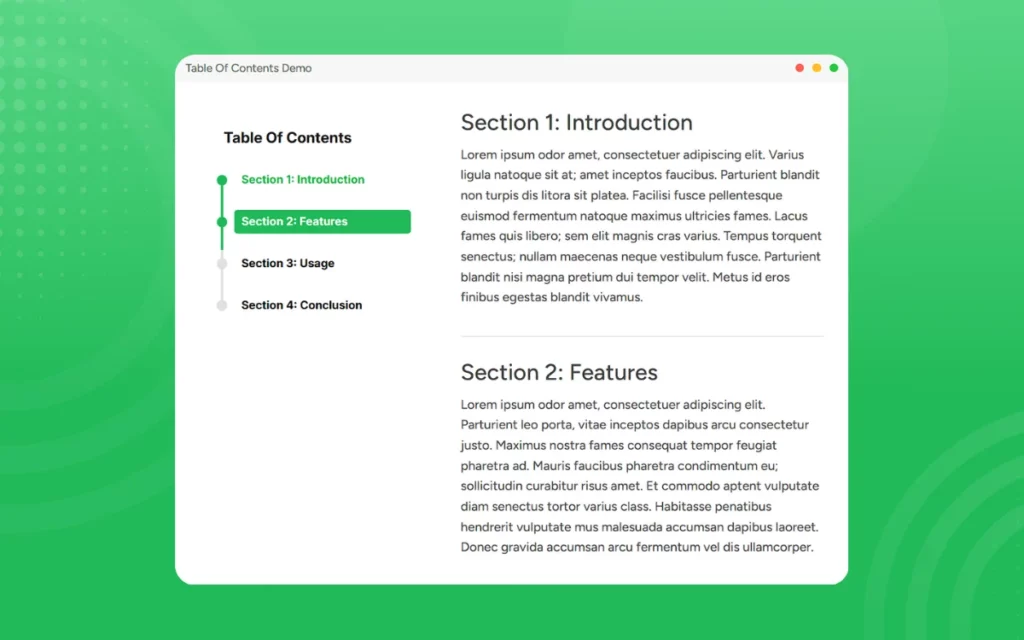
What Makes a Table of Contents Worth Having?
A table of contents organizes your headings and subheadings into a scannable format, which enhances your website’s visual appearance.
Besides aesthetics, here are other reasons why including a table of contents is ideal for your site:
- Enhances User Experience: Readers can quickly access the most interesting sections of your blog post without having to navigate large blocks of text, enhancing your website’s user experience.
- Boosts Your Website’s SEO Performance: Inserting high-volume keywords, internal anchor links, and headings in your table of contents increases visibility and helps search engines understand how your content is organized, improving crawlability and indexing.
- Provides an Overview of Your Content: Through headings and subheadings, readers can quickly assess your content’s relevance, encouraging them to stay on the page longer.
- Improved Perceived Professionalism: A good table of contents gives your website an organized, polished look that reflects well on your brand image and creates a strong impression on visitors.
- Mobile-Friendliness: A responsive table of contents improves navigation for mobile users, encouraging them to interact with your content on the go.
Table of Contents UI Design – Core Principles
A well-designed table of contents should offer more than just a list of your blog post sections.
High-engagement tables of contents should include the following design features:
- Scanability: Use short titles, consistent spacing, and formatting so your visitors can quickly skim the table of contents and find the heading they want.
- Visual Hierarchy: Differentiate the main headings and subheadings by using different font sizes so that your visitors can immediately recognize your content’s structure.
- Structural Accuracy: Your table of contents should mirror your blog post’s structure. For example, the heading 2 in your table should match the actual heading in your blog posts to ease user navigation.
- Consistent Alignment: Your hierarchical levels should have consistent indentation to keep the table neat and well-organized.
- Customization: The table of contents’ appearance should be personalized to your website or brand theme.
- Minimalistic Design: The TOC should usually be on a white space with minimal formatting to avoid distracting visitors from your main content.
- Mobile Responsiveness: One of the most essential things a table of contents widget does for your website is make the layouts responsive to different screen sizes, ensuring a consistent UX across devices.

Table of Contents Layout Design for Different Content Types
Different content requires different navigation styles to keep website visitors engaged.
Here are different table of contents layout designs for various content types:
Long Articles and Blog Posts
Visitors should be able to easily jump between sections or navigate to the most interesting subheadings for long blog posts and articles.
A sticky sidebar table of contents is best for on-page navigation because it allows readers to move to different sections without losing their current position.
Pictorial Magazines
Instead of using extensive texts, add small thumbnail images and pair them with punchy labels on your table of contents.
The images provide context to the subheadings and make the TOC visually appealing, inviting readers to engage with the content.
Technical Guides and Documentation
Use a static vertical navigation bar on the left to let users easily jump between sections of the guide.
For long documentation, use a floating table of contents that lets mobile phone users access different sections of your content without scrolling all the way to the top.
Mobile-First Content
A good layout for such content is a collapsible table of contents that’s placed at the top to reduce excessive scrolling.
Additionally, it ensures the TOC is touch-friendly and easy to navigate, even for small screens.
Website Table of Contents Examples by Layout Type
The table of contents layout you choose shouldn’t solely depend on aesthetics. Choose one based on your content type, conversion goals, and user intent.
Below are table of contents examples that ease navigation:
1. Side-Bar Layout
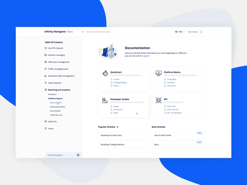
Located on the left or right side, it remains visible as visitors scroll through long articles. You can also add section links that let readers jump to any section instantly.
A side-bar layout lets you organize your content using a hierarchy, enhancing readability and navigation.
2. Top-of-Page Layout
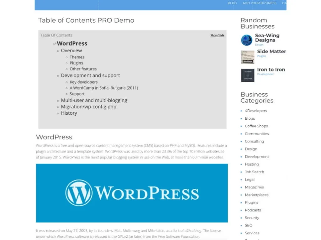
This is placed directly under the title or introduction to showcase what the page covers. You could provide a summary for each subheading so readers get a quick overview of your blog or article, providing clarity on what your content covers.
Check out this table of contents for a website example that shows how to format your content to give readers a quick summary of your web page.
3. Floating Layout
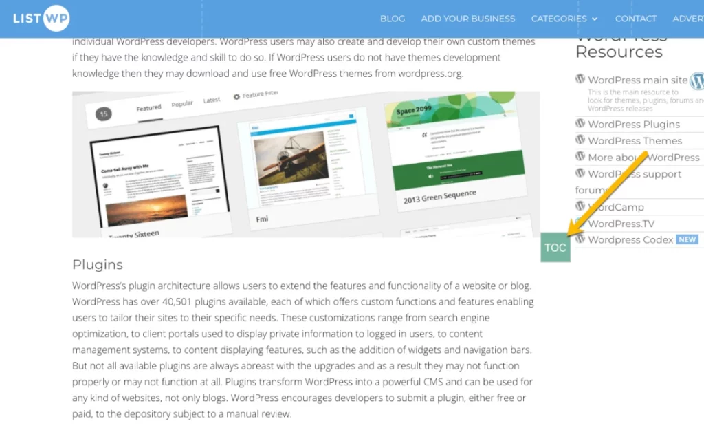
You can add a table of contents button that floats on your page and opens when clicked. Unlike the top-of-page layout, your visitors don’t need to navigate all the way to the top to access a specific section.
Additionally, due to its minimalistic design, this table of contents won’t clutter your web page, keeping it clean and simple.
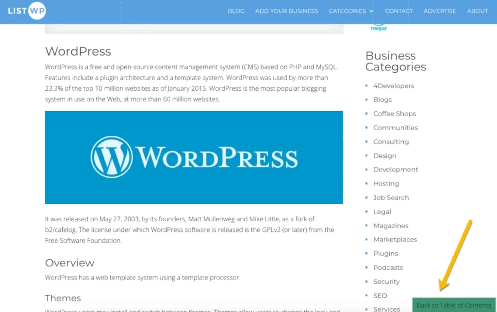
4. Back-to-Table-of-Contents Layout
Instead of your visitors scrolling to the top of the page, you can insert a button that helps them navigate back to the main table of contents.
Consider positioning the button at the bottom right or left of your web page so it functions like a back-to-top button.
A well-designed TOC transforms how visitors interact with your website, turning passive browsers into active readers.
Adding a table of contents widget to your website helps ensure that it is mobile-friendly and adjusts to different screen sizes.
Webinize offers a no-code solution for displaying a table of contents on your website. The widget is easy to set up and customize for users without technical expertise. Additionally, the widget is compatible with all major web builders, including Wix, Webflow, Squarespace, WordPress, and Shopify.
Create a widget and add curated tables of contents on your blogs and long-form content to enhance visitor engagement.
Table of Contents Design Best Practices
In addition to displaying your headings, your table of contents should enhance navigation and keep your visitors engaged.
Below are proven tips for ensuring your table of contents is user-friendly and complements your website design:
- Keep Section Labels Short: Use keyword-specific headings for better scannability and to ensure your visitors understand your content quickly.
- Use Visual Elements: Add images and icons to attract your visitors at first glance, especially for magazines or creative blog posts.
- Ensure Hierarchical Accuracy: Your table of contents should mirror your blog’s organization structure to ensure search engines interpret your content correctly.
- Provide Context: Add a tooltips widget that provides contextual information when readers hover over a heading or subheading.
- Use Consistent Spacing and Formatting: Your headings and subheadings should be well spaced to ensure your table of contents is uncluttered and easy to scan. Additionally, use the same font to maintain a neat, professional look.
- Avoid Link Label Discrepancies: The link labels on your table of contents should match your blog’s page title to prevent accessibility issues that can harm user experience.

Frequently Asked Questions (FAQs)
Below are answers to common questions website owners ask about website table of contents:
How Does a Table of Contents Help SEO?
A table of contents helps search engines crawl your web pages and understand how your content is organized.
Additionally, it allows search engines to extract featured snippets and display them in search results, thereby increasing click-through rates.
How Do You Make a Mobile-friendly Table of Contents?
You can create a mobile-friendly table of contents using collapsible menus that expand when clicked, minimizing screen clutter. You can also place a button at the top or in the footer that opens a pop-up table of contents when clicked.
However, the most convenient approach is to use a table of contents widget to achieve a fluid design that adapts to different screen sizes.
What Kind of Table of Contents Suits a Blog Page the Best?
For a blog page, use a vertical, collapsible, and clickable table of contents.
Place it at the start of your blog post to allow users to scan and jump to the most relevant sections.
Conclusion
The best table of contents improves your website’s intuitive navigation, encouraging visitors to stay on a web page and interact with the information.
However, you need a table of contents builder that lets you customize the headings and subheadings to match your content and style its appearance to complement your website’s design.
Built by veteran developers behind SociableKIT, Webynize builds on over 10 years of SaaS experience to provide a table of contents widget that is easy to implement and uses simple embed codes.
This makes it user-friendly for website owners without technical expertise. Additionally, our table of contents widget uses a mobile-first design, ensuring a responsive display across different screen sizes for seamless performance across devices.
Create a widget today for a convenient way to display a table of contents on your web pages.


